
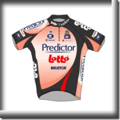
Your Jersey is SOOOO Ugly…
When you’re riding in a paceline, you have time to think. You can ponder the big questions in life. You can think back and review how you’ve lived. You can think about changes you’d like to make in your life.
It was on just such a ride a few days ago, my eyes unavoidably on the back and butt of the cyclist ahead of me, that I had an extremely deep thought. The thought is as follows:
“Most bike jerseys are really, really ugly.”
Why
I don’t plan to justify my position that most bike jerseys are ugly, because I think this statement is not debatable. I simply do not believe there’s a reasonable counterargument to be made.
However, we can ask ourselves why bike jerseys tend to be so ugly.
I have theories.
 Blame it on the Pros
The most obvious reason we have such ugly jerseys is because we’re used to seeing ugly jerseys. The pro teams out there are beholden to whoever their sponsor is at the moment, which really means that they’re beholden to the disgruntled designer/would-be-artist at the outsourced marketing company their sponsor is currently using.
And what is the designer’s job? Simple: make the jersey into a billboard.
They do a fine job of this. And the pro cyclists, since they get paid to wear the billboard — even if the billboard is advertising a home pregnancy test, and the color of the jersey is what you get when the result is positive – don’t put up a fuss.
The weird thing is, though, we normal people don’t get paid to wear the billboard, but we do anyway. This can be explained with the following perfectly logical reason: we are sheep. Colorblind sheep. Colorblind, aesthetically blinkered sheep.
Though I bet there are very few men or women out there in the universe willing to spend their own money on wearing a jersey advertising a home pregnancy test.
 It Was Free
I’ll bet each and every one of us has at least one jersey that we wouldn’t pay a dime for. But since we got it as part of the schwag bag for doing an event, well that’s a different story.
Here’s the thing about those event jerseys: they’re designed by the guy on the event committee who wasn’t there to devolunteer himself on the day they chose an event jersey designer.
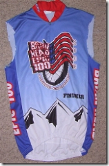
There’s an upside to those ugly event jerseys, though. Since you didn’t pay for them, you don’t have to feel even remotely guilty for “customizing” them. Here, for example, is my jersey for the 2003 Brian Head Epic 100. (I tell you that, because the text on the jersey itself is nigh unto illegible, and it’s worse in real life). I transformed it into a sleeveless jersey in the middle of a ride a couple weeks ago, using nothing but my teeth to take out a couple stitches, and then using my patented super ripping technique.
I had an intriguing tan pattern by the end of the ride.
 It’s Hilarious
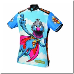
You know what would be really, really funny? If someone put a picture of Grover on a jersey! Or of a skeleton riding a bike! Or of a Reese’s Peanut Butter Cup!
Actually, that last idea is quite awesome.
The problem with comedy-based jerseys is that punchlines are only funny for three seconds. Scientific fact. But if you’re wearing a comedic jersey, you’re wearing it for the entire ride. The timeline of your riding companions’ impression of your funny jersey is as follows:
- Seconds 0 – 3: Hey, that’s funny! A jersey with Grover on it! That’s both clever and whimsical!
- Seconds 4 – 10: But why is it the “Super Grover” character? And why is he flying? That’s not all that funny anymore.
- Seconds 11 – 20: What kind of person wears an image of a bumbling muppet? Why would anyone pay money to wear an image of a bumbling muppet on a bike ride? And it’s not like this is the only time he’s going to wear it, either. I’ll bet he wears that same stupid jersey next ride, too.
- Seconds 21 – Forever: I need to figure out a way to either kill this rider, tell him I’m never riding with him again, or — at the very least — destroy that moronic jersey.
In short, comedic jerseys aren’t just ugly. They’re potentially lethal. Wear at your own risk.
Design May Be Larger Than It Appears
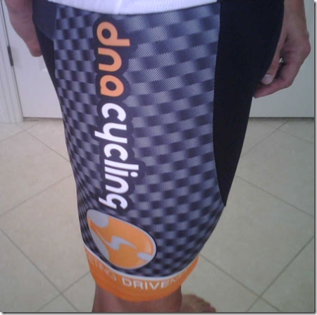
Back in Winter, a local cycling team — Team DNA (Dirt ‘n Asphalt, get it?) — had a clever idea: make their team jersey look like it’s made of carbon fiber. The mockup looked pretty cool. I would have bought the jersey in fact, if I weren’t so lazy.
Dug and Rick Sunderlage — neither quite as lazy — succumbed to the coolness of the idea of a carbon-fiber-looking jersey and signed up.
And then the jerseys (and accompanying shorts) arrived.
Here’s Dug, modeling the ensemble. First, front:

And now the shorts.
Before I go any further, I think I have the same question the rest of you have: what’s with the hand placement, Dug?
But anyway.
The problem with the mockup is that it didn’t show what the “carbon fiber” part would look like when it’s actual size, which I will hereby demonstrate:
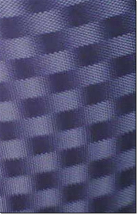
Yes, that’s right. You can play checkers on team DNA’s race kit. Or, if you stare at it long enough, you will either wreck (likely) or begin to see a 3D depiction of Grover. Flying.
Safety
I have, at times, worn astoundingly ugly jerseys intentionally, reasoning that a garish jersey is more likely to draw the attention of drivers. I don’t think that a brightly-colored jersey has to be ugly, however, so I’m rejecting that idea.
The Ugly Jersey Contest
I believe that everyone has at least one ugly jersey. And I believe it’s time to have a contest to determine: who has the ugliest jersey of all?
Let’s introduce the contest with a new cartoon from my son:
[flash http://www.fatcyclist.com/blogphotos/cyclation2.swf]
How Do You Enter?
If you’ve got an ugly jersey — or know someone else with an ugly jersey — get a picture of it and contribute it to the brand new Flickr Ugly Jerseys group I created.
Whether you’re going to submit a photo or just want to see what others are entering, you’re going to need to register with Flickr. Also, to see all the photos, you’ve got to join the Ugly Jerseys Group. Luckily, that’s relatively painless. Just do this:
- First, to www.flickr.com/signup and follow the standard signup rigamarole to get registered. Luckily, it’s free.
- This step is important. If you don’t do this, you won’t be able to see all the photos: Once you’ve registered with Flickr, you need to join the Ugly Jerseys group. That’s easy: Just go to www.flickr.com/groups/uglyjerseys/ and click Join this Group. Now you can see the photos for the photo contest at www.flickr.com/groups/uglyjerseys/pool/.
How it Works
If you know how to use Flickr, you can skip this part. If you’re new to Flickr, here’s how you upload a picture.
- Go to the Flickr Upload page: www.flickr.com/photos/upload.
- Browse for your photo(s) – you can enter up to three photos in this contest. Photos are automatically resized, so don’t stress about having it be a particular size before you upload it.
- Click the Upload button at the bottom of the screen.
- Enter captions for each of your photos. Be interesting and descriptive. If you can’t be both, be one or the other.
- Click the Save button at the bottom of the page.
- Now you’ve got to make your photo part of the Ugly Jerseys group. To do that, from your “Your Photos†page (you should be there already) click your picture. You should see options of what you can do with that photo above the picture now.
- Click “Send to Group†to make a menu drop down. From that menu, choose Ugly Jerseys.
- OK, that’s it.
Your photos should be added to the gallery pretty much immediately.
When and What You’ll Win
You have through Monday (because I’m going to be out of town for a few days) to get your ugly jerseys photographed and uploaded. I’ll then choose a winner and announce it on Tuesday. So you have plenty of time to enter.
And what can you win? Well, first prize gets a cool Fat Cyclist Special Edition Banjo Brothers Commuter Backpack.
And second prize? You get this ugly jersey, kindly donated by Julie.
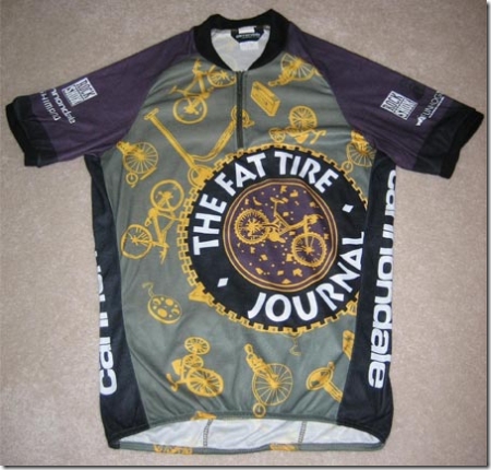
Hey, I’ve seen worse.
If you want your jersey to be one of the prizes for this contest (and are willing to pay for the shipping), indicate that on your entry, and we’ll throw that into the Ugly Jersey prize pot. I’m happy to give away as many ugly jerseys as you’re willing to contribute.
PS to Team DNA: Actually, your jersey is super-sexy. I’d still wear one, except it gives me a terrible headache to look at. Please don’t kill me.
Comment by bikemike | 06.28.2007 | 12:10 pm
first off, i thought that was a u.f.o. in the top left hand corner of the video. your son is headed for a career in sound effects or as a contributor on the daily show when he’s older.
secondly, even though diet pepsi has no sugar, it is still hard to clean off of a monitor after passing through the nose. must be a phlem thing or something. fatty jr. rules!
hopefully when discovery bails out this year, they’ll finally get someone with some sense of style to do their bike kits.
Comment by Stephanie | 06.28.2007 | 12:16 pm
I knew i should’ve taken a picture of the guy wearing a jersey with Bruce Lee on the back.
Comment by winner27 | 06.28.2007 | 12:32 pm
I love Super Grover.
Your son is hilarious!
Comment by BotchedExperiment | 06.28.2007 | 12:43 pm
That’s supposed to be carbon fiber!? I’ve seen those jerseys and shorts 100 times (well, almost) and it never occured to me that it was supposed to be anything except a random checker pattern, and by random, I mean ‘there’s no reason to have this checker pattern on the jersey, except that there is aparantly some law that states jerseys can not be solid colors, so why not a grey on dark grey checkered pattern?’ I actually feel better about those jerseys now that I know the design was actually supposed to represent something!
Love the combustion inducing ugly jersey. Something similar happens everytime someone says “Hog’s Hollow” within earshot of dug.
Comment by dug | 06.28.2007 | 12:45 pm
the hand placement might have more than one possible explanation.
1. i needed my arms out of the way so you could get a picture of the JERSEY instead of my ARMS.
2. remember when we did your big epic b-day ride around timp on dirt? remember indian springs? remember when kenny said it was okay to drink the water?
well, it’s not. NOT.
Comment by mark | 06.28.2007 | 12:49 pm
I’m pretty sure dug and his DNA jersey have already won the contest. Wouldn’t be so bad except that the matching shorts are so atrocious that the ensemble is really only good for soaking in kerosene, wrapping around the end of a stick, and using as a torch. Maybe Kenny will remember to wear this kit next time he takes off on a 100+ mile solo ride with nothing more than a banana and a water bottle.
Comment by Anonymous | 06.28.2007 | 12:55 pm
Say what you will about the DNA team kit but those shorts are the most comfortable shorts i have ever worn. I might even get a pair for Elden to try.
Ugly is good. Who wants to ride behind black shorts will a solid jersey…eww.
Actually, if you look into the jersey and make your eyes go blurry, you will see a PG-13 image. You’ll have to come ride with me or Dug to find out what it is.
Comment by Tim D | 06.28.2007 | 1:01 pm
not read the whole entry, went straight to the Genius Son of Fatty cartoon. Another winner. I’ll read the less talented wordy bit tomorrow.
Comment by Al Maviva | 06.28.2007 | 1:18 pm
I’m officially lodging a protest. This contest is completely lame because it misses the point underlying the ugly jerseys. The point is that the jerseys are usually horrendous because on all the world’s ugliest jerseys, at least two sponsors duked it out to see who would be placed in the most prominent position on the jersey, in the most garish colors and text, in such a way as to be visible to journalists, spectators, Velo News photographers, people with camera cell phones, and in tiny thumbnails on people’s random internet photo collections. Yes, they fought about this. Boggles the mind, doesn’t it?
Until you have been in the room with a sponsor who wants to know where his $4500 went, who makes his point by shredding the new team jersey you tried to give him, you just haven’t seen angry. You don’t have to remove their name… just move it from the seat of the shorts to the shoulders, from the shoulders to the back pocket, the front chest to the back… Doesn’t matter! Danger, Will Robinson! Danger! Hell, I am scared by some of my club’s $250 sponsors, and they only get a 2″x2″ on the back pockets…
Hence my suggestion for the next contest. Two sponsors, selected at random from a Fat Cyclist reader’s jersey duke it out for jersey placement. Two sponsors enter, one sponsor leaves.
Preferably the sponsors will be drawn from same line of work. (For instance, my club is sponsored by two LBS’es, which are bitter, bitter rivals. Don’t know how we pulled that one off. Other possibilities are getting the local Italian deli to duke it out with the local French wine shop, or getting the Powerade rep to throw fingers at the Cytomax monger, maybe with the Hammergel hippie looking on). On a live webcast, we’ll get the sponsors in the room, tell them that they have to dice for dibs on logo placement, then let them rip.
It will be the best, most honest fighting, since James Brown’s last wife kicked him out of the house and set his clothes on fire.
Club management, of course, will not be permitted to participate – otherwise the sponsors, without prompting, will turn on them and tear them to pieces. I have seen this happen and it is truly ugly to be involved in, but a real spectacle to watch, kind of like a Mike Tyson fight except more brutal and inexplicable, and if possible, dirtier.
What’s that? You want to know what the prize is? The prize is nothing. After the fight you’ll tell the winning sponsor that you had already selected him but forgot to send the screen art to the jersey printer, so you’ll be happy to take his check but he’ll have to wait ’til the Winter clothing order to get his name on the jersey. Come to think of it, that sort of sets up a sequel fight. The more I mull this idea over, the more I like it.
Comment by Jay Parkhill | 06.28.2007 | 1:26 pm
What i’ve noticed that that uniforms/activity-appropriate apparel are almost uniformly ugly, and yet designate the wearer as a participant fan. Next baseball you watch check out the knee-high socks and ask yourself “why?”
And how about the nylon track suit business tennis players wear? Or motorcyclist leathers? Or skiers? And what is cool about hip-hop style pants falling down?
What does this say about us as humans- we wear clothing that is ugly by objective standards, yet cool to others in our “club”.
The only exception to this I know if is lawn bowlers. All white clothes. Doesn’t really matter what they are as long as they are white. Nice.
Comment by anonymous 2 | 06.28.2007 | 1:48 pm
Fatty,
You hit the nail on the head when talking about the DNA jersey you stated
“… if you stare at it long enough, you will either wreck (likely) or begin to see a 3D depiction of Grover. Flying.”
Most of the guys that have the DNA jerseys are too busy, lazy, tired, overworked, (insert more excuses here) to spend much time training but would still like that podium finish at the local race. By spending a few bucks on biking equipment, no, i am not talking about an expensive titanium component upgrade, i am talking about the carbon jersey, it allows you to paint that fence for your wife and get those reports done for your boss and then still allows you a podium finish because the opponents crash out of the race, it will be money well spent. For now i am going to go on a training ride in my DNA outfit with supergrover and some checkers.
Comment by Metronome | 06.28.2007 | 2:03 pm
What’s even worse is when you see matching his/hers super grover and bert&ernie jerseys peddling across the street in front of you while sitting at a stop light.
What I don’t understand is how you (as a couple) can see that and think “it would be cool if we both had muppet jersey’s”
Lastly, why does Ernie have a banana in his hand extending it out; what’s that about?
Comment by Born4Lycra | 06.28.2007 | 3:35 pm
While accepting you and others are not looking for an argument here I would just like to say I reckon brightly coloured (insert garish here if you like) bike clothing is brilliant. The brighter the better. I have through my work seen accidents involving cyclists where they were just not seen and a bright lycra top would have made all the difference. I am not aware of any accidents where the cyclist was hit because he was wearing a bright lycra top but I guess it is possible and maybe the drivers involved would not admit it.
I still have my standards however and that Grover top would stretch them as would the Domina (I think) Zebra print of a couple of years ago. I am on the lookout for and would however wear a Silver Surfer (my boyhood comic book hero) one as that would be at least plentysix cool as is the Primal Dark Side of the Moon top. Also I have been interested in the odd comment regards the pink FC top where some people have indicated they will buy it for a friend but could not come at wearing pink themselves. I reckon once you’ve committed to wearing the lycra and putting your body shape on show for all to see the colour does not really matter.
Comment by fatty | 06.28.2007 | 3:49 pm
born4lycra, i’d like you to go back and read the section above called “Safety,” and then reassess your comment in the context of aforementioned section. Thank you for your attention to this matter.
right with you wrt the notion that once you’ve elected to wear tight black shorts and a form-fitting polyesther top that fussing over pink is picking at nits.
Comment by Born4Lycra | 06.28.2007 | 7:34 pm
FC fair enough point taken.
Comment by Argentius | 06.28.2007 | 11:43 pm
Your son has watched way too much strong bad / “teen girl squad,” plus “the end of the world.”
Alaska can come too.
Comment by TheLurker | 06.29.2007 | 3:19 am
“Distrust any enterprise that requires new clothes.”
– Henry David Thoreau
Comment by Kathy | 06.29.2007 | 3:50 am
Awesome cartoon! I just watched it again. The sad thing is that not only are dangerously ugly jerseys given away, they are also sold at ridiculously high prices. Then, when no one buys them, they go on sale for 70 percent off. Who can resist the power of a more-than-half-off discount?
Comment by TIMK | 06.29.2007 | 4:07 am
“Modesty died when clothes were born.” – Mark Twain
Al’s commentary was quite informative. Guess you sponsored racers are nothing but smaller, human-powered NASCAR racers.
I have always tried to avoid anything but solid jerseys until the TwinSix FC came along. Never wore a team jersey because I felt them to be “poser-esque.” The only thing I owned that could possibly be submitted was a Performance long sleeve day glo yellow jersey, but it’s gone gone gone. Oof, those things are ugly.
I think after this contest runs it’s course, you need to do some positive stuff – like coolest event jersey. We already know what the coolest jersey is.
Comment by Big Mike In Oz | 06.29.2007 | 4:52 am
Born4Lycra/Fatty… bright colours don’t help with the safety factor. Cars are blind to bicycles (and their drivers aren’t much better).
I weigh in at around 230 pounds and most of my jerseys are red. Fire engine red. That size and that colour should mean that every car on the road sees me from 3 miles back but nooooo.
Just this afternoon I had to clip out and use my cleat to install a $800 gouge in a car door just to enforce my territory on a round-about near home. There was no excuse – 2pm on a clear day. Drivers look for things equal to or bigger than themselves. Motorbikes and bicycles are little more than bugs.
Comment by Grover | 06.29.2007 | 6:34 am
You call pretty shirt with me moronic?
You say I am Bumbling Muppet?
You think outline of horsey better?
You soon find out what fistful of blue fur taste like! (PS: Not cookies!)
Comment by Warren T | 06.29.2007 | 6:34 am
I’m hoping Google will come up with WiFi enabled jerseys so the ads will update based on the riders location… Hey, it could happen.
I still think the tweeds I saw on Velorution’s site are the way to go once it turns cooler. Discussion on jerseys – grubbies – tweed suits is available here:
http://commutebybike.com/2007/06/27/cycling-fashion/
Comment by KeepYerBag | 06.29.2007 | 6:53 am
Regarding Shadow Scythe: The apple does not fall far from the tree. Funny stuff.
Comment by Al Maviva | 06.29.2007 | 7:23 am
TimK, you’ve uncovered the sad and horrifying truth about roadracing. It is *just* like NASCAR. If you stand really close to the pack in a professional road race, or get a chance to ride in the commissaire’s car, you will hear things, shocking things.
Like when Liquigas chased down a dangerous Astana break on the Stelvio, in the Giro, you would have heard: “Massimo, Leonardo, Giancarlo… molto bene. That’s how y’all git ‘er done… Bello.”
And in Liege-Bastogne-Liege, you would have overheard this over Team Francais de Jeaux’ team radios: “Christophe, Francois… le CSC train has jumped. We go now, pursue. Boogity boogity boogity, let’s go racin’!”
And perhaps the most disturbing interview of came after Fabian Cancellara won Paris Roubaix last year. When Paul Sherwin interviewed him, he said, “I just want to thank Jesus, and my sponsors, and the crew. We take it one day at a time, they did great out there. I didn’t think we’d make it ‘cuz I was tradin’ paint with the Tide bike and the #8 bike, but that’s racin, and that’s why they let ‘em run. The Budweiser bike with the Michellin-Accellerade tires was really runnin’ great today, the shifting by Shimano/Smith Barney/Sutter Home Wines worked pretty well on the hills, and the Assos/Go Army.com/STP Oil Treatments chamois butter kept my butt comfy even though we just raced 256 kilometers in 90 degree weather.”
Yep, it’s really disturbing to find out that your heroes in the Italian pro peloton all speak with a southern accent. When they said that DiLuca is the first Southern Italian winner of the Giro D’Italia, this is what they were talking about. You didn’t think he was from Naples, did you?
Of course this is no more disturbing than finding out that the Columbian F-1 driver Juan Pablo Montoya is winning NASCAR races…
Ps. Did anybody else hear about that, and imagine JPM saying, “My name is Juan Pablo Montoya… you raced my father… prepare to die”?
Comment by Brian C | 06.29.2007 | 7:25 am
unrelated: dave nice just dropped out of the GDR. sad face. hes still bad to the bone, 800+ miles on a fixed mtb. go dave!
Comment by sans auto | 06.29.2007 | 8:27 am
Having riden several long tours (that seems to attract bizzare clothes) I noted that purple and yellow clothes may make their contents seem larger than actual size. Additionally circle designs make things look large. Yellow and purple circles on even the skinniest individual will make Sir-Mix-Alot proud.
As for being seen, I want jersey that is road sign yellow with a big black arrow pointing left on the back of it. If I’m lucky the motorists will be mistaken and try to avoid me.
Comment by Clydesteve | 06.29.2007 | 8:40 am
Ps. Did anybody else hear about that, and imagine JPM saying, “My name is Juan Pablo Montoya… you raced my father… prepare to die�
Al Maviva – They should have a REC button on this site. As in “I just REC’d my plasma screen spitting hot coffee on it.”
Argentius – Yes, there IS some subtle Strong Bad / Teen Girl Squad influence here, but it cannot be considered derivative because of the originality of the subject matter, and the incisiveness of the dialogue, don’t you think?
Comment by mark | 06.29.2007 | 8:52 am
Sans Auto–I like the idea of traffic signs on jerseys. Would be fun to do experiments to determine which are most effective. Stop signs, deer crossing, school zone–lots of possibilities. I’m guessing the most effective approach (without regard for other factors) would be to hire one of those “oversize load” escort cars to drive behind you at all times on the bike. Except maybe for accuracy sake, it could be labeled “undersize load” while maintaining the flashing lights and other fanfare.
Considering deer crossings, though, how sad is it that most drivers are probably more concerned about hitting deer than hitting other humans on bikes? Granted, most cyclists don’t arbitrarily jump into traffic and then just stare at the car speeding towards them, but still.
Comment by MAJ Mike | 06.29.2007 | 9:31 am
“the Assos/Go Army.com/STP Oil Treatments chamois butter”
Al, I can’t believe you put the Army in the same butter as Assos. You will now have to be trampled by swine (which would be a good name for a band).
Comment by BIKEMIKE | 06.29.2007 | 10:31 am
Maj.Mike, you got it.
Trampled By Swine, opening for Butt-Ugly Jerseys
Comment by DerekB | 06.29.2007 | 1:01 pm
OH. . . MY . . . GOD!!!!!
I have been wearing that “Ugly” jersey with the Fat Tire Journal on it for years now. Like 10+ years. I use it as my “Toned-Down” mountain bike racing jersey.
I am crushed that you put it up there as the ugly jersey contest prize. I love that jersey.
Damn you. Now I can’t think of it as my cool jersey that no one else has.
Comment by Mehera | 06.29.2007 | 1:08 pm
I guess it’s a matter of taste. The Fat Tire Journal jersey appeals to me, too. It is nicely designed and interesting. Agreed that the others–especially those that are just a mish-mash of advertising–are pretty bad.
Comment by dawn | 06.29.2007 | 1:16 pm
Just checked out the pics – that Chef jersey is one of the worst I have ever seen. It can’t possibly appeal to anyone.
Comment by KatieA | 06.29.2007 | 2:30 pm
I would like to win the jersey to give to the cyclist I almost hit whilst driving home last night (I live 40km from work, across the other side of Sydney, it would take days to ride there, so don’t shoot me).
The Scene: 7pm, pitch black night, roads still slightly wet from rain.
The Cyclist: dark blue / black business suit, no helmet, no lights, no reflective items of any sort on bike or self, carrying a BRIEFCASE. No, not a messenger bag or something that you can put over your shoulder – A BRIEFCASE.
Me: in car, headlights on, going through roundabout (having checked for any traffic), and almost taking out cyclist.
We both stopped and he preceeded to berate me about watching for cyclists. I told him that if I can’t see you, I can’t stop for you, and pointed out the obvious flaws in his “but you can see the light reflecting off the spokes” argument, and that he’s one of those cyclists that gives us a bad name, because he’s a tool. Then I called him a few names that I won’t type here, as it’s a family blog.
The Best part – the car that had been behind me stopped as well – big muscly guy got out and said “mate, you’re lucky it wasn’t me, or you would have been a speedbump”. :)
Comment by Born 4 Lycra | 06.29.2007 | 4:18 pm
Big Mike in Oz have to disagree. Although I commiserate with you over todays incident and I hope there was no police involvement then or at a later date. I work for DTEI and regularly consult with various Road Safety bodies and am also involved in Road Accident Investigations and Road safety audits. Usually these accidents are fatalaties involving more than one person and on occassions they involve cyclists. In most (not all) bike related fatalities/investigations the error has been on the part of the vehicle driver (pissed, drugged or stupid) but in a lot of the cases the cyclist has also made a compounding error in not being or even attempting to be visible. Our evidence suggests that riding in bright lycra is indeed safer than not and is infact safer than fluoro clothing and with flashing lights especially pre dusk through to post dawn is the best combination. This may be for no other reason than it is soooo ugly or damn attractive that it catches the eye and therefore attention of MOST other drivers. There will always be the idiot that doesn’t see you but I guess here we are playing the odds. KateA’s is a classic example except in this case the cyclist is alive thanks probably to a cyclist aware driver.
Comment by Col | 06.29.2007 | 9:55 pm
Al, you are hilarious.
Can anyone explain Argentius’ references? The “strong bad/teen girl thing. And Alaska?
Comment by Mike Roadie | 06.30.2007 | 1:27 pm
Note to self………buy a Grover jersey—-NOT. Anyone who wants to pretend they can go fast, hang with the gang and/or climb should not wear jerseys with cartoon characters or cereal brands on them. I mean really……Wheaties???
I would only wear the Grover one because I have Grover’s disease, which makes you break out in extremely painful, extremely itchy little red bumps all over your body. Not good for a cyclist in warm weather!!!
The Lil FC cartoons are right on……and may be a reason people start to come to the site everyday…….I’m not sayin’……..I’m just sayin’
One more thing……someone I don’t know of just dropped $200 on my website for the LAF challenge: http://austin07.livestrong.org/mlevin Was that someone from here??? If not, why not!!!!
Also, the DNA jersey is cool…..if not totally hallucinogenic!!
Cheers—–good weekend everyone!
http://austin07.livestrong.org/mlevin
Comment by Byrdbth | 06.30.2007 | 7:08 pm
The reference to strongbad/teen girl squad comes from an internet cartoon called home star runner about this white blob with no arms and kinda forest gump like-http://homestarrunner.com/- is the web site.
Comment by barry1021 | 07.1.2007 | 1:38 am
DerekB
Not to worry–the implicit request is to judge the ugly factor through the eyes of a roadie. I say this because from what I have seen, nobody gives a Lammler Loogie about what they wear off road. THerefore if you do have an ugly jersey (well, like your Fat Tire monstrosity for example, heh heh heh), you simply wear it OFF road and VOILA!
“Dude, cool shirt, and I like the way it goes with your faux tiger paw pantaloons, too!”
Al M, as usual most informative to learn the relationship between pro cycling and NASCAR. I spoze one difference is in cycling the driver is juiced and in NASCAR it’s the vehicle
Comment by Bob | 07.1.2007 | 9:39 am
Claiming the DNA jersey is uglier than other cycling jerseys is like saying a male figure skater’s outfit is more gauche than other skater’s outfits.
Comment by mark | 07.1.2007 | 5:00 pm
Bob–touche. I do, however, maintain that soaking the DNA apparel in kerosene and using it as a torch is favorable to actually wearing it. Those faux carbon fiber shorts are less desirable to look at than the Mapei shorts that Luigi, the 6′5″ 250 lb Italian, often wears on group rides.
Comment by David | 07.1.2007 | 5:13 pm
I only have one real bike jersey, so I put up a picture of it, I mostly wear my yellow shirt, so I put up a picture of it, and added a mismatched blue/gray deal, just because I already had the picture up on Flickr.
Comment by buckythedonkey | 07.2.2007 | 2:34 am
Fabulous link Warren! The search for the perfect legware-to-accompany-the-FC-jersey is over. Move over Dug’s green trews, gimme a pair of those slate and orange plus fours!
Comment by TIMK | 07.2.2007 | 6:35 am
Al, your post about the link between NASCAR and pro cycling was awesome. And Juan Pablo should hire you as a publicist.
It’s a shame that we can’t win with concept jerseys because I have often considered designing a jersey that incorporates the star-spangled banner, Dale Earnhardt, a confederate flag, and a Jesus fish (Ichthus) so that I would hopefully attract less ire from folks on country roads in North Carolina and Virginia. Bubba would be veering in his old Ford and see the Jersey. He’d see the flags, the number 3 (oh, Dale must have been aware of the trinity!), and the fish and just maybe he’d say, “Well awwwwright! Go spandex kid! Git’r done!”
Comment by Bitter (formerly known as Lissee) | 07.2.2007 | 7:51 am
I just browsed through flickr, and got a laugh! It looks like Grover now has a competitor in the form of Curious George. lol
Comment by Nick Hawkins | 07.2.2007 | 7:23 pm
I think the only two dorked out jerseys I got was one from my alma mater (Northwestern) and the Twin Six Argyle. That’s as far as I’ll go. But this don’t stop me from wearing a cucumber in my pants so when I sit up and ride, I get looks
The Argyle jersey got me some comments when I was riding around the south side of Chicago. Some brothas said “you got flair.” That made me loller.
And fatty, please please please make Twin Six get a XXL men’s jersey for me to ride. Or come up with some “Team Fatty” merch. That’d be swell.
Pingback by Cycling Humor - a Passing Score « My Weblog | 02.8.2008 | 1:05 pm
[...] If wearing both, you  should give yourself two points. If the club kit is ridiculously ugly <http://www.fatcyclist.com/2007/06/27/your-jersey-is-soooo-ugly/> , give yourself three points. This is a judgment call, but I  think I can trust you on this. [...]
Trackback by Fag rape porn. | 10.9.2008 | 7:32 pm
Free movies porn rape beastiality….
Rape porn….
Trackback by EasyTomatoes.com » Blog Archive » Tips to Organize Your Kitchen on a Budget | 06.10.2009 | 2:02 pm
EasyTomatoes.com » Blog Archive » Tips to Organize Your Kitchen on a Budget…
I started assembling ingredients while the rice cooked (in the rice cooker, received the same Christmas from my sister- in- law). I sliced up avocado, cucumber, and the fish, and attempted (unsuccessfully) to make a Japanese omelet. For starters, I had…